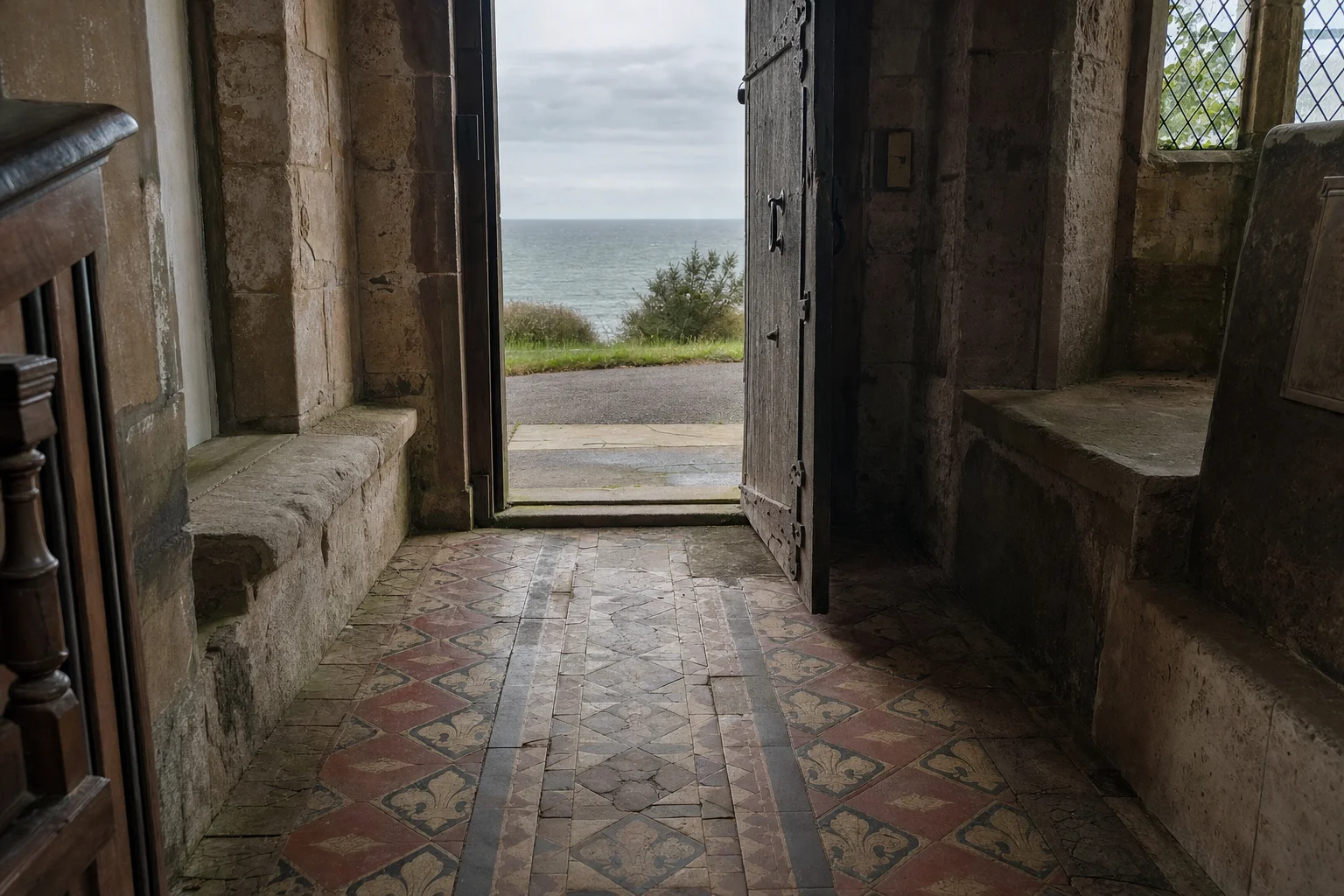
I have been building a series of pages where the computer generates the pattern: tin-glazed tiles painted by rule, cut tile and poured cement, heraldry, knotwork, a piece that breaks another piece, brick in raking light, the seventeen ways a wall can repeat and iron and silk. We’ve been travelling round Europe, mostly round Spain, borrowing from the art and the history of each place. This one comes home. England has its own tile, and it is made by pressing a pattern into one clay and filling it with another.
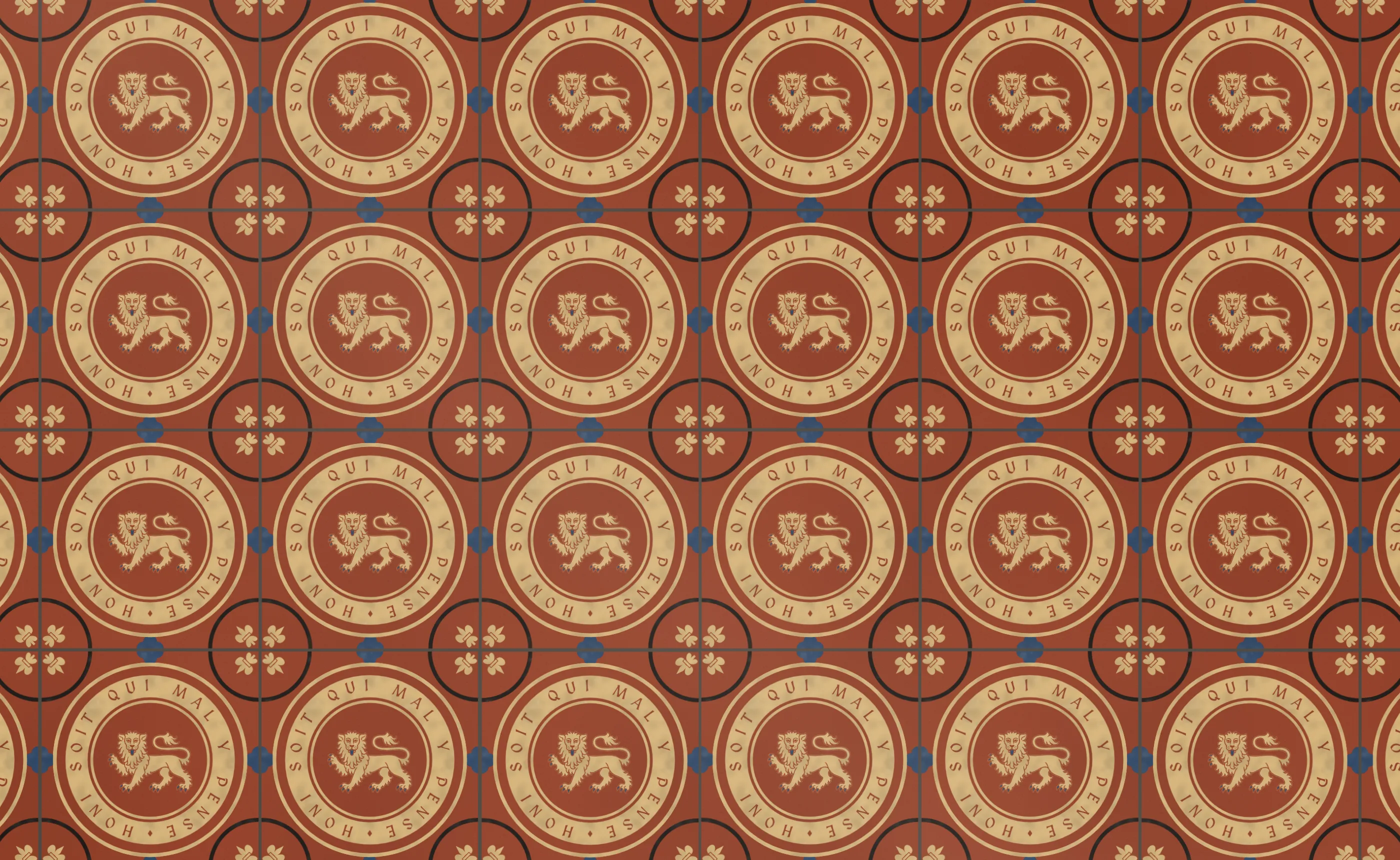
Encaustic, the town hall preset. Buff and black and blue clay pressed into a red body, the leopard of England traced from the drawing Leonor’s shields use, and the Garter motto round it.
Rosa y Granada
Rosa y Granada came first, in October, and never had a post of its own. Catherine of Aragon arrived in England in 1501 with the pomegranate of Granada as her badge, and for twenty-odd years it was carved and painted beside the Tudor rose wherever the king’s works went. The page puts the two on a floor in the English medieval way, which is the inlaid tile. A red earthenware tile was pressed with a wooden stamp, the recess filled with white pipeclay slip, the surplus scraped off level, and the whole glazed with lead and fired. The lead glaze turns the white yellow and the red a deep brown. There are two colours and no brush, so the only hand in it is the stamp, cut once and pressed a thousand times, and the slip, which goes on thick in one place and thin in another.
On the page, an inlaid tile is two operations. A recess is filled with another clay, and a line of the body is left standing between two fills. Every painter on the page is one or the other. The rose is five heart-shaped petals inlaid in slip with a smaller rose of five more left standing in the red body inside it, which is how you get a red rose on a white one with only one colour to fill with. The pomegranate is the one traced for Leonor: its silhouette goes in as slip and the drawing’s black lines are reserved in red.
Six hundred years later
Inlaid tiles died out in the sixteenth century and came back in the nineteenth. Samuel Wright of Shelton patented a way of making them in 1830, Herbert Minton bought a share of the patent in 1835, and A. W. N. Pugin wanted floors for the Gothic churches he was building and, from the late 1840s, for the new Palace of Westminster. Minton made them to his designs. They were called encaustic, from the Greek for burnt in, and within a generation they were in every church porch, town hall and hallway in the country.
The idea is the same and nearly everything around it changed. The body was pressed in a plaster mould and the hollows filled with liquid clay. There were four or five colours instead of two: red, buff, black, blue, sometimes white or green. The surface was left unglazed. The inlay went deep enough to outlast a century of boots, where the slip on a lot of medieval tiles was thin enough to walk off. And the tiles came out of the factory by the hundred thousand, all one size, to be set out with a string line by a contractor rather than bedded in lime by a mason.
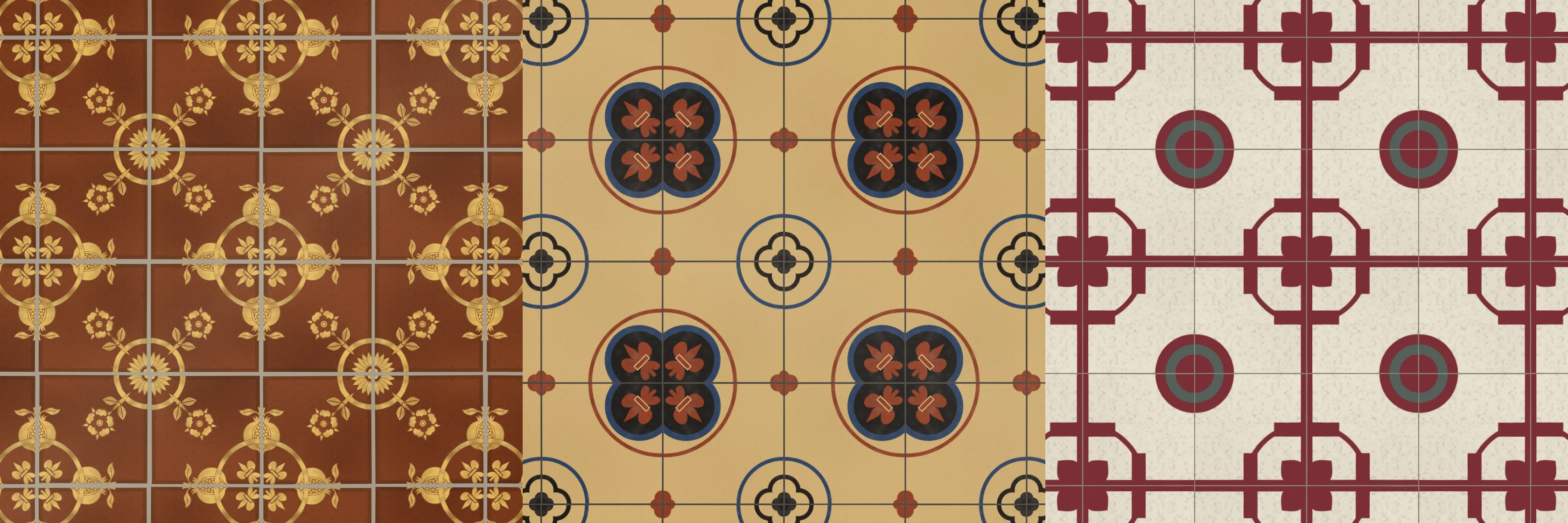
Westminster from Rosa y Granada, westminster from Encaustic, and zaguán from Hidráulico. A medieval floor, a Victorian one, and a Barcelona one from a generation later.
One file, two recipes
The medieval material lived in Rosa y Granada’s page, because nothing else needed it. Encaustic does, and a material that two pages share belongs in a file of its own rather than in the engine, which every tile page imports. The engine takes a material object with hooks for how a shape is filled, how the ground is laid, how far a tile strays from its cell, what the joint is and what age does, and it doesn’t need to know that two of its pages are made of clay.
So the stamp operations, the rose and the lily moved into clay-assets/clay.js, and the material became two recipes. Each one says what the clay looks like up close (the colour functions are trimmed here):
const RECIPES = {
  // white slip in red clay under lead, 1250 to 1550
  medieval: {
    mottle: mottleOf(1501, 60, [4, 14], dark, light),
    speck: speckOf(1254, 160, [0.3, 0.8], dark, light),
    // the glaze pools against the edge of the inlay as a dark hairline
    pool: (pal, col) => hexA(pal.tint, 0.45),
    poolW: 1.1,
  },
  // clays pressed into clay in a mould, 1840 to 1900
  victorian: {
    mottle: mottleOf(1840, 40, [6, 18], dark, light),
    speck: speckOf(1851, 110, [0.25, 0.5], dark, light),
    // two plastic clays pressed together bleed a hair into each other
    pool: (pal, col) => hexA(col, 0.5),
    poolW: 0.7,
  },
};
The medieval one is heavier everywhere: more mottle where the slip went on thick and thin, more iron coming up through the glaze, a dark line where the lead pooled against the inlay. The Victorian one is flatter and finer, and the line at the edge of an inlay is the inlay’s own colour, a hair of one clay pressed into the next. Around those sit the two materials. The medieval one has a glossy surface, a wide lime joint and tiles turned and shifted by hand. The Victorian one is matte, with a thin cement joint and tiles that sit almost exactly in their cells.
Moving the material is a refactor of a page that people can link to by seed, so it had to change nothing. I hashed every preset’s canvas and the card thumbnails before the move and after it, and they came out byte for byte the same.
The cousins of Hidráulico
Hidráulico was the first page to use the material hook: the Azulejería engine with the glaze swapped for pigmented cement, the way every hallway in Spain was floored between 1880 and 1960. Put the three side by side and Encaustic sits between them. Like the medieval tile it is clay inlaid in clay and fired. Like the cement tile it is pressed, matte, many-coloured, made in a factory and laid by the square metre, and it wears rather than crazes. A cement tile’s colours meet with no outline at all, because the brass divider lifts out and leaves them butted together. A Victorian tile’s colours meet with that faint line where two wet clays touched, and a medieval tile’s meet with a dark one where the glaze pooled.
The wear shows the difference best. Age on the medieval floor takes the glaze off along the walked line and the slip off the middle of each tile, so the pomegranates fade to brown ghosts. Age on the Victorian floor dulls it, works dirt into the joints, scratches it and cracks a few tiles straight across, but the pattern stays.
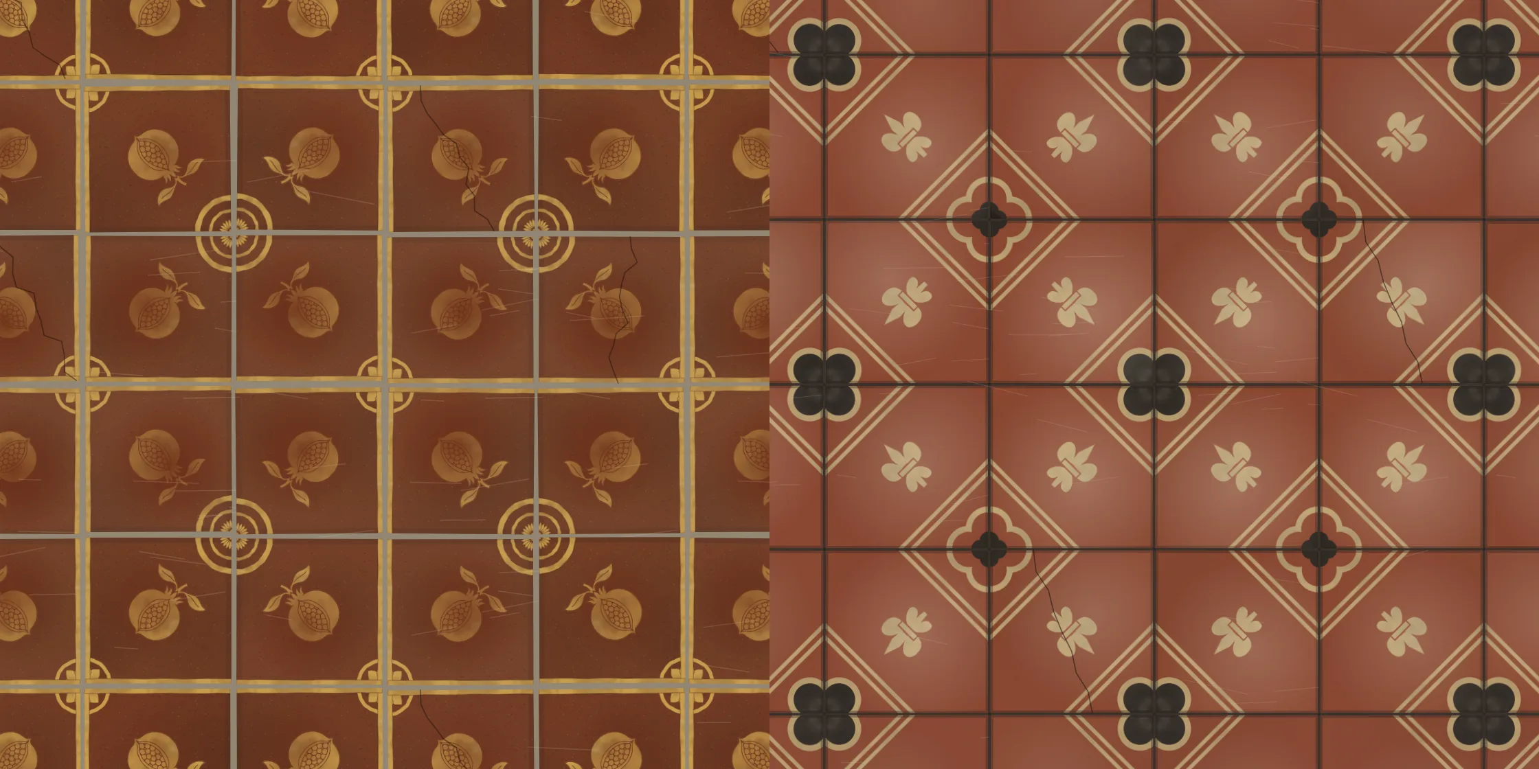
Nave from Rosa y Granada and porch from Encaustic, both with wear on. The medieval slip walks off; the Victorian inlay doesn’t.
Gothic nouns
The motifs are the Victorian Gothic ones. Quatrefoil puts a four-lobed Gothic foil round the corner where four tiles meet, lobes on the diagonals, a lily in each lobe pointing out, and a circle round the lot. Each foil is a ring of circles whose outer arcs run from one cusp to the next, and the band is that outline at two radii filled even-odd, with a field of another clay inside when the seed wants one. Diaper is Pugin’s lilies in a net of lozenges, the lozenges’ points at the middle of each edge so the net runs on across the floor.
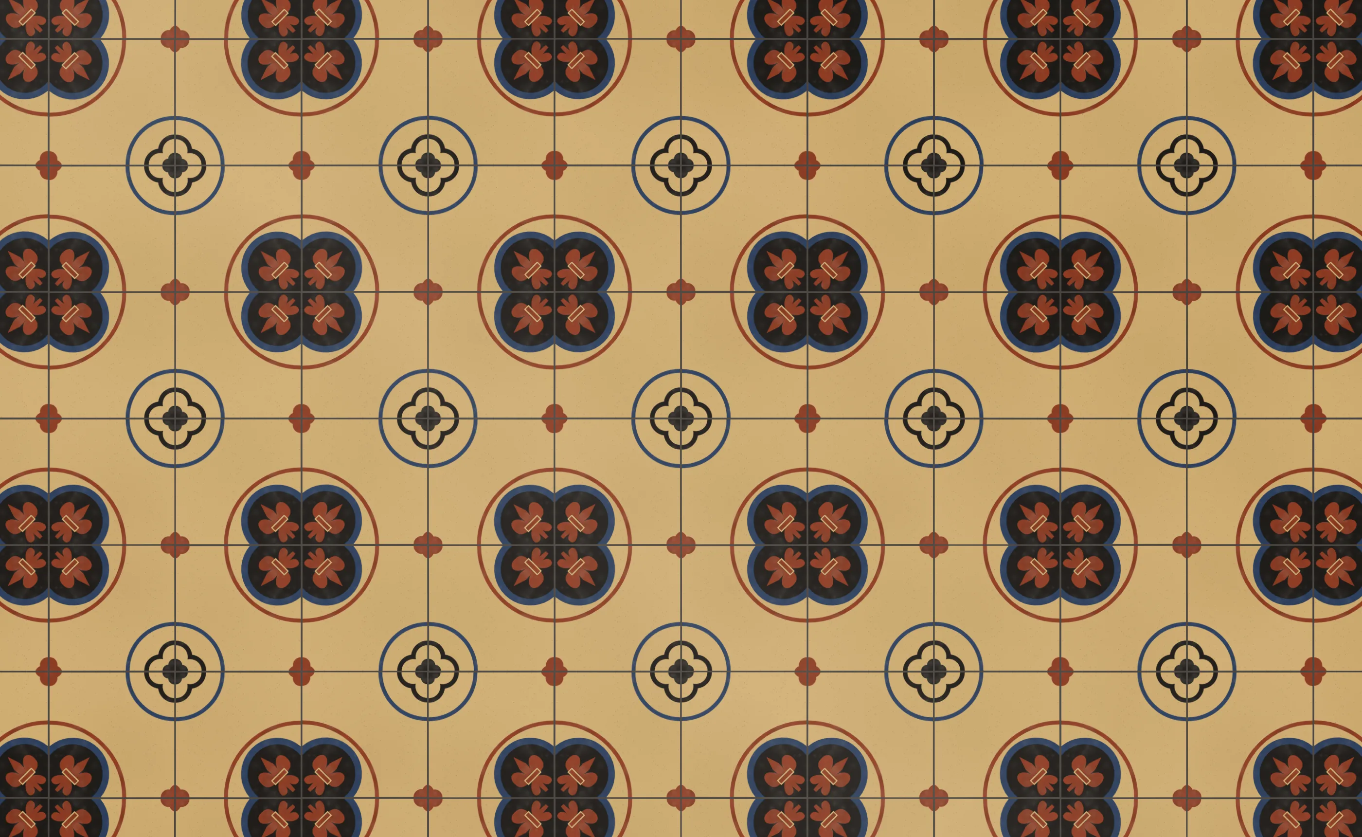
The westminster preset. Four tiles make each quatrefoil; the small foils between them are where four far corners meet.
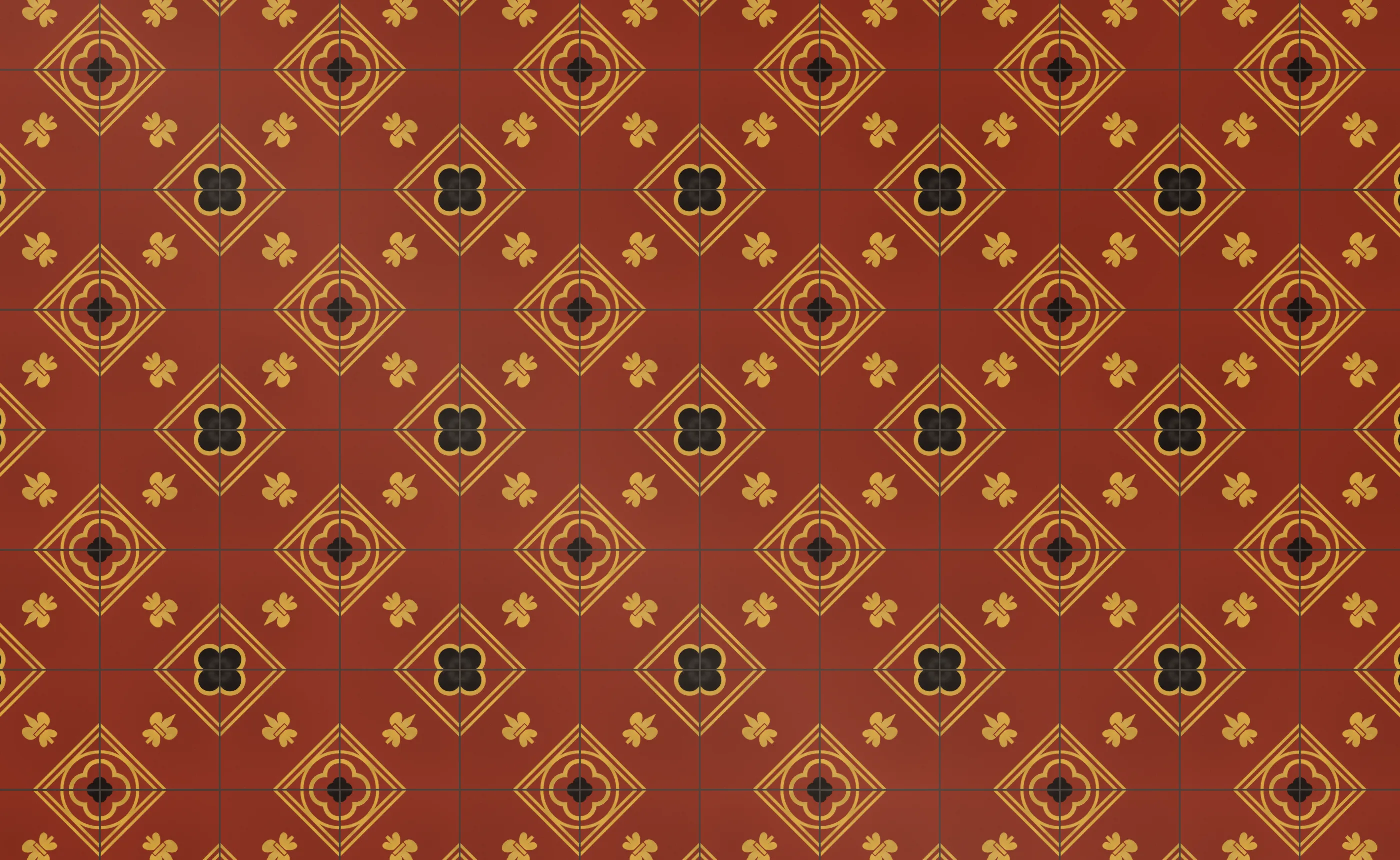
The pugin preset: gold on red, lilies in lozenges.
A word has a right way up
The other two motifs were the hard ones, because they have a right way up. The engine’s module repeat mirrors every other tile, which is how a design that only fills a quarter becomes a pattern four tiles wide. Mirror a rose and it is still a rose. Mirror a lion and he faces the other way, and mirror a motto and it is mirror writing. The single repeat lays every tile the same way up, but it builds the tile itself from four mirrored quarters, so even there a word drawn in the design comes out backwards in two of them.
So the lion and the motto are drawn once, whole, by a painter that works out where it is. The engine paints the four quarters in a fixed order, and the last of them is turned half round, so it is the only one that isn’t mirrored. The painter reads the canvas transform, does nothing on the first three quarters, and on the last one throws the transform away and draws the roundel square to the tile in device pixels:
medal(el, b) {
  const { g } = b;
  const m = g.getTransform(), W = g.canvas.width;
  const quarter = Math.abs(m.e * 2 - W) < 2 && Math.abs(m.f * 2 - W) < 2;
  if (quarter && !(m.a < 0 && m.d < 0)) return;
  const cx = quarter ? 0 : 0.5, cy = cx;
  const k = Math.hypot(m.a, m.b), R = (quarter ? el.r : el.r / 2) * k;
  g.save();
  g.setTransform(1, 0, 0, 1, m.a * cx + m.c * cy + m.e, m.b * cx + m.d * cy + m.f);
  // ...the band, the motto, the field and the device, upright
  g.restore();
}
Nothing else can stop the wall itself mirroring or turning the tile, so those two motifs lay the single repeat whatever you choose, and the repeat menu changes to say so. A Victorian tiler wouldn’t lay a lettered tile backwards either.
The lettering is MedievalSharp, which is near enough to the Lombardic capitals Pugin used. A motto runs clockwise round the band from a small lozenge at the bottom, so it reads up the left side and across the top. Each letter is measured, the gaps are spread so the motto fills the ring, and a short motto goes round twice rather than spacing its letters out to the width of a tile. My first try used an uncial face, which draws H like a d, and a town hall floor that said HONI SOIT read rather differently. Where a Victorian chancel floor had scripture, mine says LOVE IS ENOUGH, after William Morris’s poem of 1872, and the other roundels carry NULLIUS IN VERBA, SAPERE AUDE, NO GODS NO MASTERS and E PUR SI MUOVE. The lion is Leonor’s traced leopard of England in buff, with its claws and tongue in blue on the palettes that have a blue.
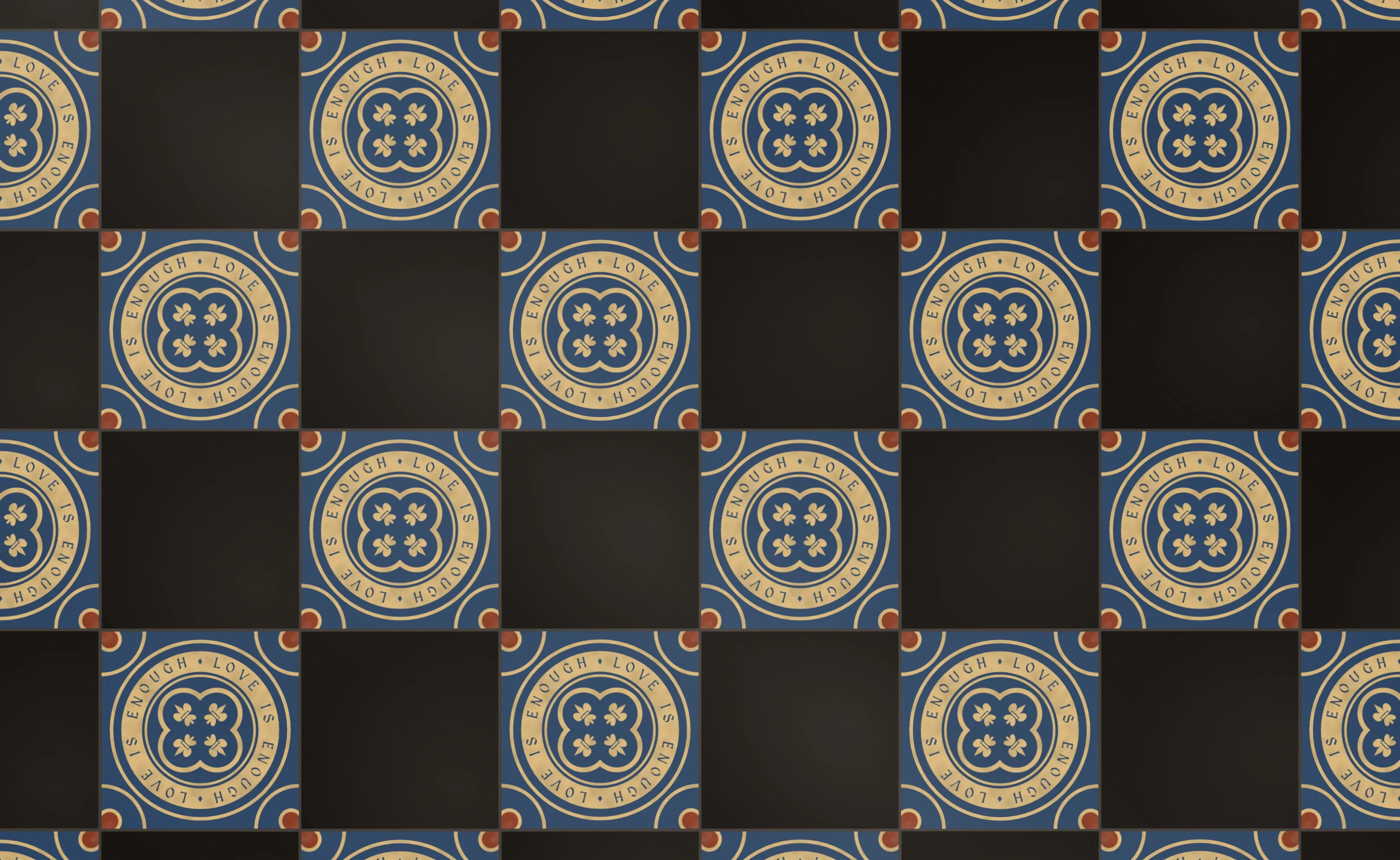
The chancel preset. Words round a foil on a blue ground, laid with plain black, the cheapest tile a Victorian church could buy.
Trying it
Encaustic has six presets: westminster, pugin, town hall, chancel, a cream and chocolate Dorset church, and a porch with a hundred and fifty years of boots on it. The advanced tab has the four motifs, five palettes, the four repeats, and a mould slider that sets how loose the press was, which for a Victorian tile is not very. Double-tap for a new design. Rosa y Granada is unchanged, and now it shares its clay with a floor six hundred years younger.
Azulejos de letras is next: Seville’s blue-on-white street-name tiles, where the lettering is the whole tile rather than a band round the edge.