All the plans turn into old tickets, half unredeemed.
The series has been working its way north. Andalusian tile, then English heraldry, then a medieval English floor, and now the furthest north it’s going to get: the carpet pages of the Lindisfarne Gospels, the Book of Durrow and the Book of Kells. Whole pages of vellum given over to ribbons that go over, under, over, under, round every corner and back, in red lead, orpiment yellow and verdigris green, with the odd dog’s head biting its own tail.
Knotwork grows those pages from a seed. It’s the most rule-bound piece I’ve made so far, and it turned out the monks had done most of the thinking already.
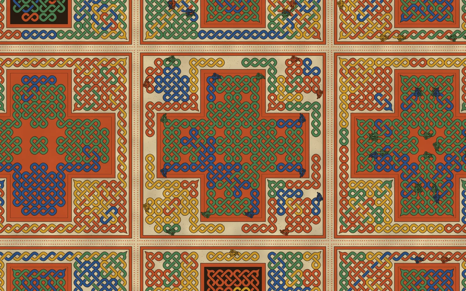
The lindisfarne preset. Seed 698, the year Eadfrith became bishop and, so the story goes, started painting.
Over, under, over, under
If you look closely at the back of a Lindisfarne page you can still find the prick marks and the ruled grid. Interlace was laid out on squares, and once you see that, the rule is short.
Take a grid of squares. Every edge has a midpoint. A strand runs diagonally from one midpoint to the next, so at every midpoint two strands cross. Do nothing else and you get a plain plait. Then pick some edges and make them breaks: a strand that reaches a break turns back off it instead of crossing. The rim of the panel is all breaks, so every strand closes up on itself. Breaks are what turn a plait into a knot, and I chose them by the panel’s mirrors so the page stays symmetric, often in runs of two or three along a line, which is where the knot’s sharp turns come from.
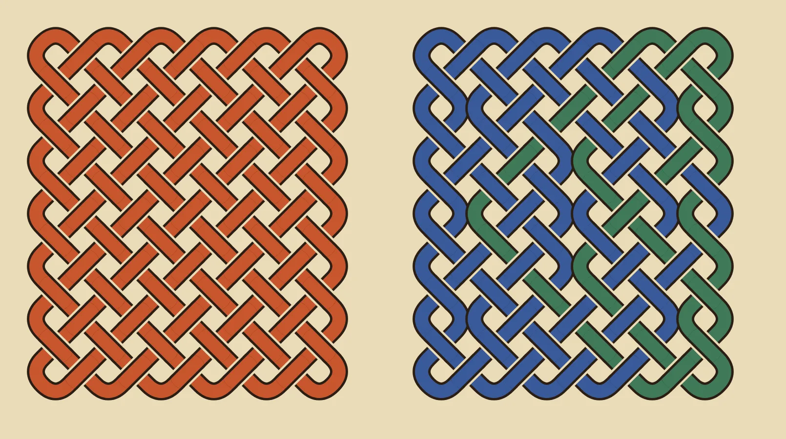
The same six by seven grid. On the left, no breaks, one plait. On the right, three in ten interior edges are breaks.
The bit I was pleased about is over and under. In Çini the strapwork walks each strand from end to end and flips over and under at every crossing it meets. Here there’s no walking at all. A crossing on a horizontal edge takes the rising strand over and a crossing on a vertical edge takes the falling one. Every step along a strand lands on the other kind of edge, and every bounce off a break flips its direction, so the alternation round every strand is guaranteed by the grid. In code it’s one line:
const over = ((x & 1) === 1) === (dx * dy > 0);
x is in doubled coordinates, where an odd x means a horizontal edge. That’s the whole of the weave.
Points in the corners
My first corners were round, and they looked wrong in a way I couldn’t name until I went back to the facsimiles. Where a strand turns in a corner of the panel, the scribes draw it up to a sharp point aimed into the corner and back out again. So the page does that now. There’s also a “pointed” setting that sharpens every bounce off the rim, which I use for the Kells preset.
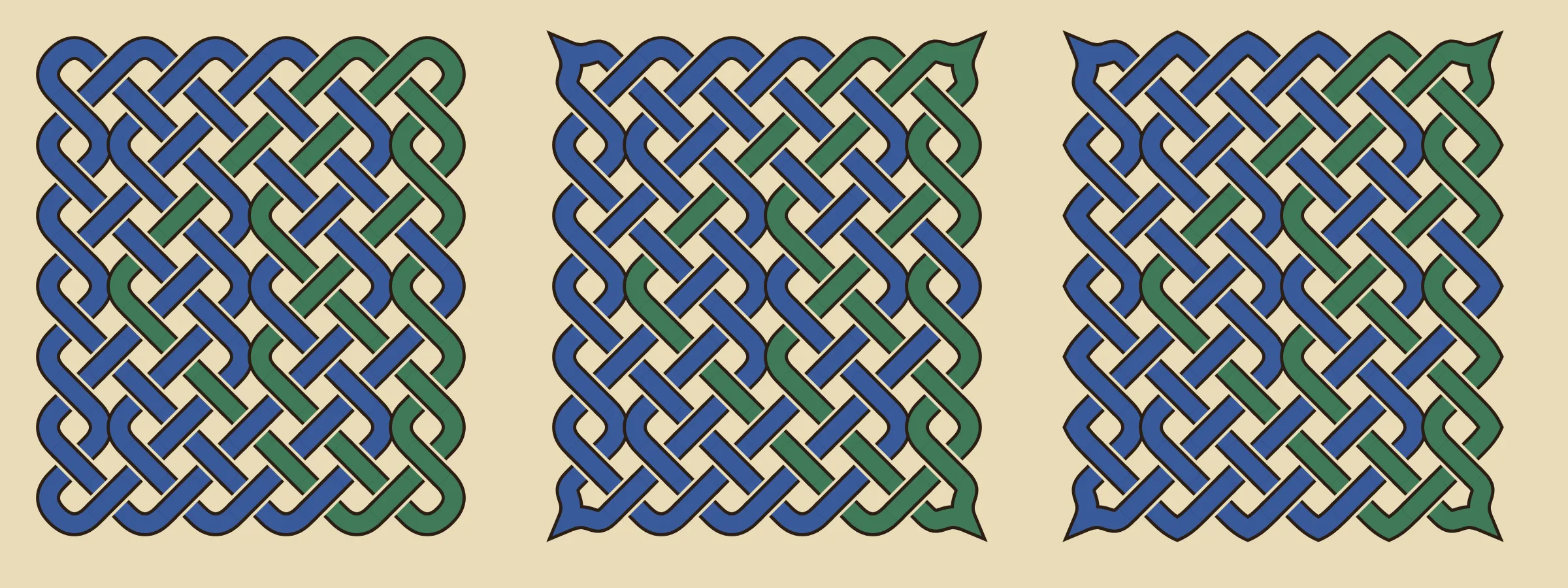
Round, corners, pointed. Same knot, three ways to turn at the edge.
The cross-carpet page in the first picture comes from letting a knot fill any region of squares, not just a rectangle. The cross is a plus of knotwork painted on a coloured ground inside a ruled channel, and a second knot fills the bare vellum around it. Then come the frame, its two rules and the red-lead dots. Lindisfarne has a page with over ten thousand of those dots on it, which is the sort of thing that makes you put the pen down for a minute.
The beasts
Insular strands don’t always close. Sometimes a ribbon ends in a head, and the head bites something, usually another ribbon or its own tail. On the grid that’s a third kind of edge, a cut, where the strand stops instead of turning. Two strand ends always arrive at a cut from the same side, so they pair up neatly: one gets a head, the other becomes the tail it bites.
The head was the problem. I drew mine from curves the way I’d drawn the first lions for Leonor, and it came out like this.
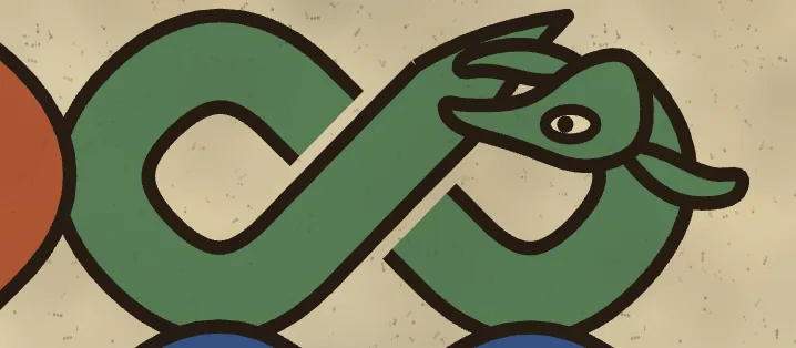
My drawn head. The question it got was “what is this meant to be?”, which was fair.
So I did what fixed the lions. I asked an image model for a flat drawing of an Insular hound’s head, one gold fill with an even black outline, a red eye, and a piece of blue ribbon gripped in its jaws so I’d know where the bitten strand goes. The neck was to come in from the left as a straight band, cut square, so I could bolt it onto a strand.
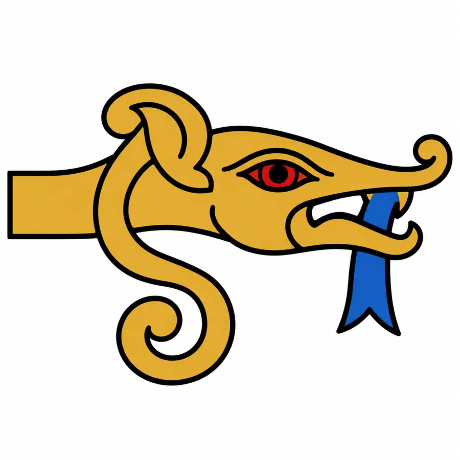
The drawing I traced. The blue ribbon hanging below the jaw was cut away first, and the bit inside the mouth kept.
The tracer is the forty lines of Node from the heraldry post. I erased the ribbon below the jaw before tracing and kept the piece inside the mouth, which now gets painted in the tail’s colour. The rest was placement. My first go pointed the head straight on along its strand, and every beast stuck out of the knot like a dog through a fence. The version that works lets the neck turn off the strand and narrow, so the head lies along the cut facing its tail, and the tail hooks round under the jaw and up into the mouth.
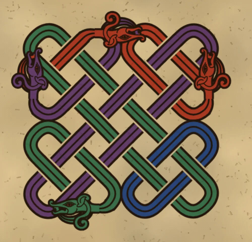
The kells preset, close up. Four hounds, each with a tail in its mouth.
Two heads on neighbouring cuts sat on top of each other and looked like a scrum, so no cut is allowed beside another now. A mirror copy that would collide just stays a plain break. The heads are still big for the grid and lie over a strand or two, and at very high zoom there’s a faint seam where the neck meets the traced head. I can live with both.
Before the painter
My favourite preset has no colour at all. It’s the page as the scribe would have left it for the painter: ink on vellum, ruled frame, a few hounds along the rims.
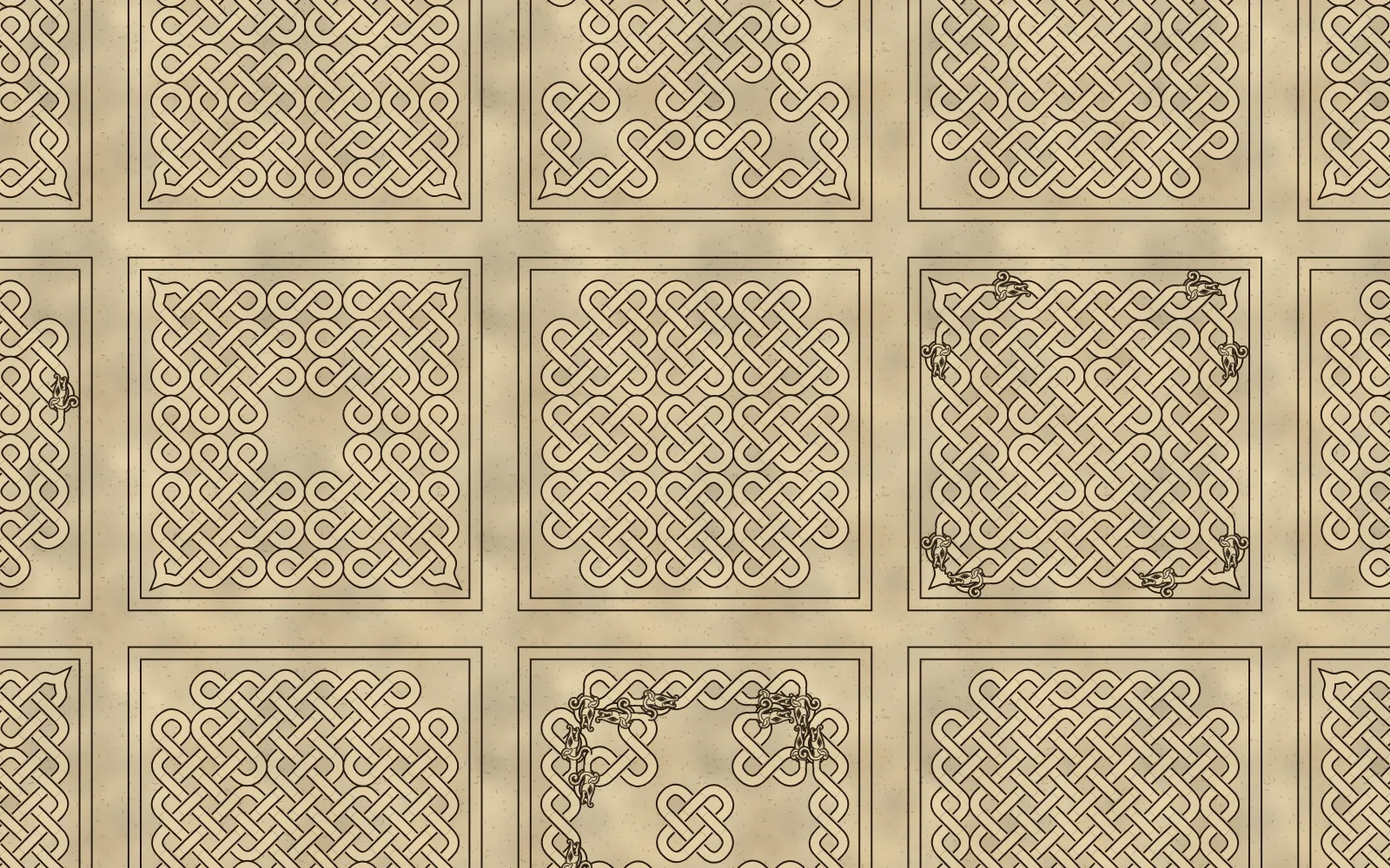
The drawing preset. Ink only.
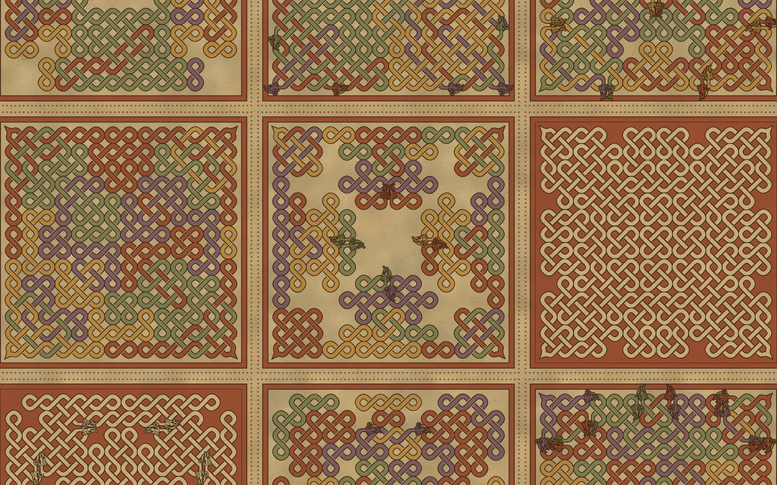
The lichfield preset, seed 730, the colour gone soft the way that book’s has.
In the package
The knots now live in azulejeria as their own module, next to the tile engine but not using any of it. It draws on any 2D canvas.
npm install azulejeria
import { buildKnot, paintKnot } from 'azulejeria/knots';
The README covers the options: masks for crosses and fields, symmetry, cuts, bends, and the traced head with its narrow neck. The knot’s grid is the same one under the Mudéjar lacería, so I’d like to see somebody use it for that. Next on the list is Sutton Hoo, which is garnets set in gold cells, and Alicatado’s cutter will do most of that work.