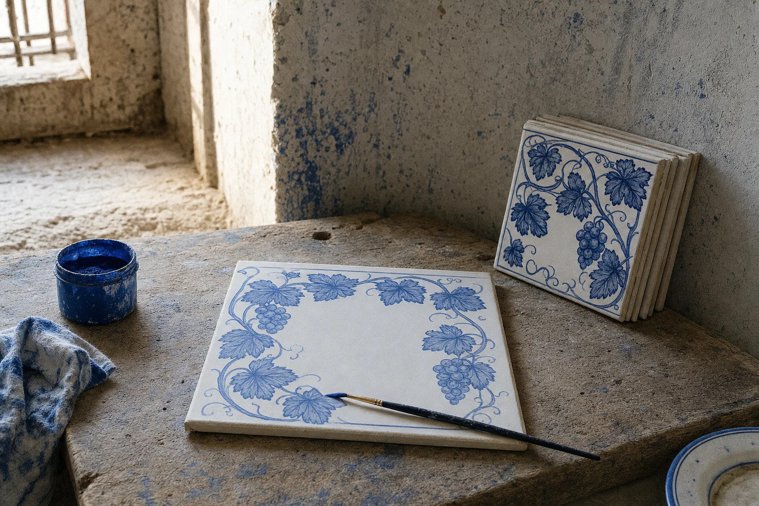
I have been building a series of pages where the computer generates the pattern: tin-glazed tiles painted by rule, cut tile and poured cement, heraldry, knotwork, a piece that breaks another piece, brick in raking light, the seventeen ways a wall can repeat, iron and silk and clay in clay. Every one of those grows a repeat from a seed. This one is different, because a word does not repeat. Azulejos de letras is the Seville street sign, and you type the street.
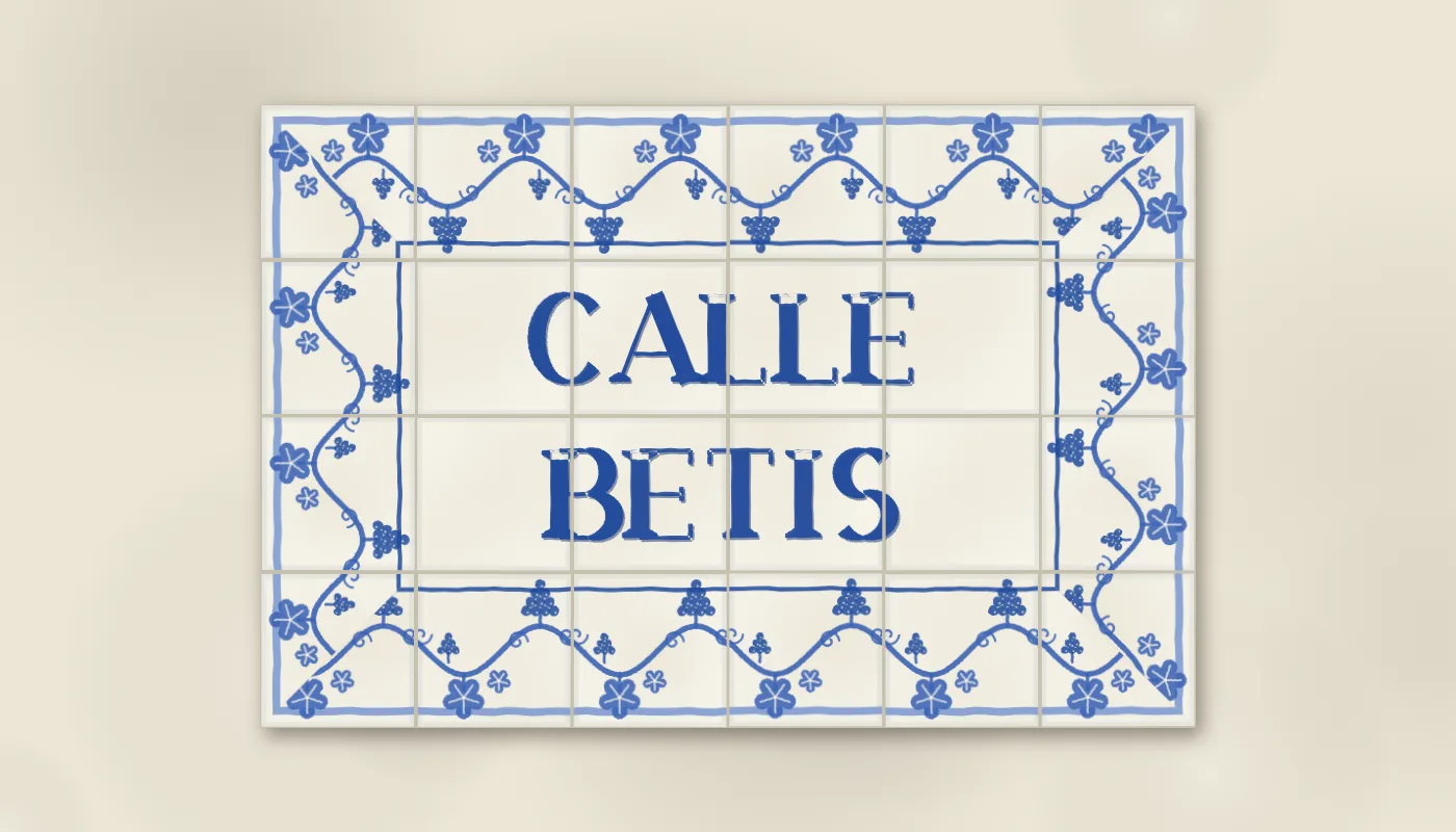
Calle Betis. The word painted across the joints, a vine of leaves and grapes round the edge, cut at forty-five degrees in the corners, all in the one cobalt.
Every street in Seville is named on a plaque of tiles. Cobalt capitals on a white tin glaze, painted across the grid as one word so the joints run through the letters, with a border of vines or scrolls round the lot that turns the corners. The potteries of Triana, across the river, made them by the thousand through the early twentieth century, and made the shop fronts too, so a bodega or a pharmacy announced itself in the same letters as the street it stood on. The letters are a nineteenth-century serif with a lot of contrast between the thick strokes and the thin ones, painted by hand onto the raw glaze, so no two are quite alike and the blue pools a little where the brush stopped.
A typeface made of strokes
The page does not use a font. Each capital is a short list of strokes in a box one cap-height tall: a stem, which is thick; a hairline, which is thin; a thick diagonal; a bowl, which is an arc; a dot; and a tilde for the Ñ. An A is a hairline up the left, a thick stroke down the right and a hairline across. A B is a stem, two bowls and three hairlines joining them. An S is two bowls back to back. That is the whole alphabet, the digits, Ñ and the accented vowels a Spanish street needs, in about sixty lines.
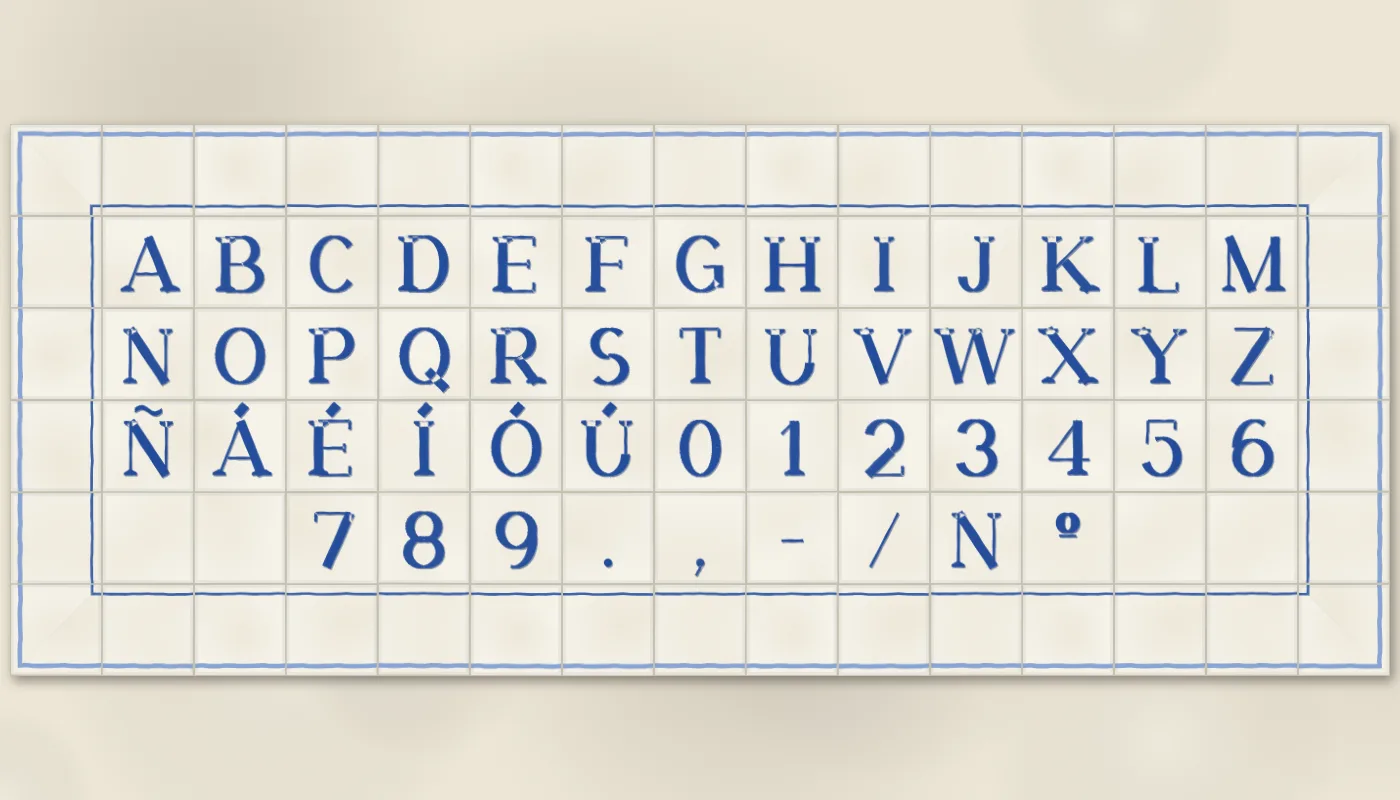
The whole typeface. Every glyph is a list of strokes; the serifs, the contrast and the wobble come from the rules, not the glyph.
The contrast is a rule rather than a drawing. A bowl’s width depends on the angle of the point along it: full stem width where the tangent is upright, hairline width at the top and bottom, which is how a Didone letter is cut and what makes an O look like an O rather than a ring. Every stem and every foot gets a bracketed slab serif, a short bar with a small curve into the stroke, drawn by the same rule whatever the letter. Change one number and every serif on the wall changes with it.
Then the brush. Each stroke becomes a polygon, the engine’s wobble runs along its edges in proportion to the hand slider, and the colour goes on the way the tile pages’ washes do: a dark pass slid a little down and right, where the glaze pools against the raised edge of a stroke, then the cobalt, then a thinner pass slid the other way. A heavier brush widens the stems and leaves the hairlines alone. The same letter on two tiles is painted twice from two seeds, so the plaque never has two identical Ls.
Across the joints, or one to a tile
The street signs paint the word across the tiles as if the grid were not there, and that is the default: the letters are set at their own widths, each line centred on a row of tiles, and the joints are drawn back over them afterwards so a stem can stop at a grout line and carry on the other side. Letters painted this way are set a little heavier, the way the real ones are. Some shop fronts did it the other way, one letter to a tile or two, and the page does that as well; when it pairs, it pairs within a word, so a space is a blank tile rather than a tile with half a word on it.
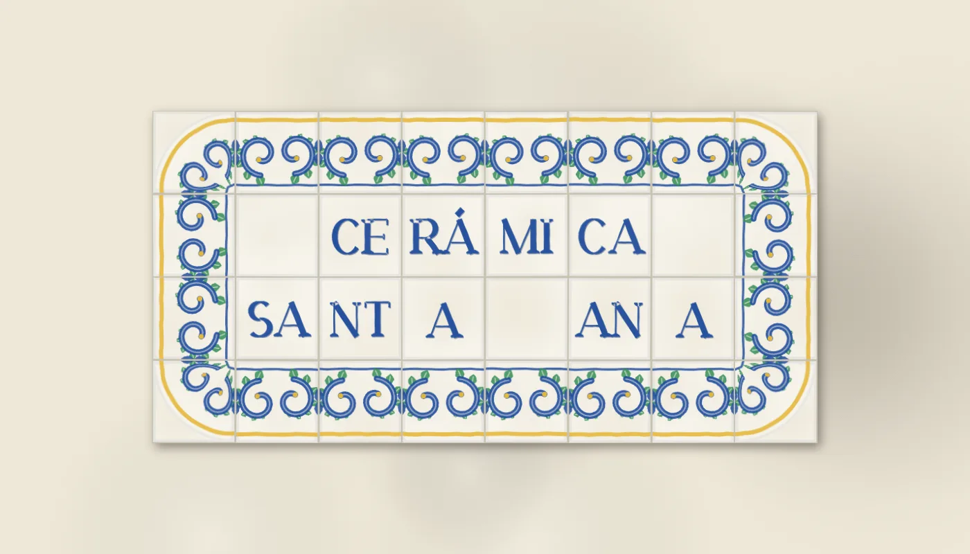
Two letters to a tile, the shop-front way, in the santa ana colours with the acanthus border.
A drop cap is the first letter at nearly twice the height, with the rest of the first line hugging it and the second line beside it. In the one-to-a-tile lettering it takes a tile four times the size. It is the same glyph at a larger cap height, and the serifs scale with it.
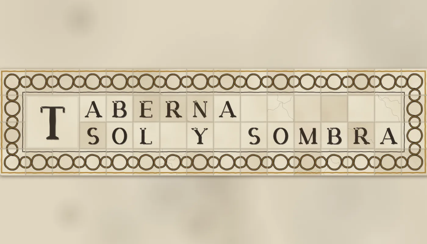
A drop cap, manganese on an old cream, with age on. The chain border’s rings run through each other across every joint.
The border is a repeat after all
The one thing on the plaque that does repeat is the border, and it repeats in one dimension, the way Rejería’s frieze runs along its rail. A border tile is drawn once, in a square with the outside of the plaque at the top and the words at the bottom, and then laid along every side turned a quarter each time, so the design always faces inward.
The corner was the hard part. A rosette on a square tile is what I did first, and it stops the border dead at each corner, where the real plaques carry the vine round. So the corner tile is the border tile bent: the strip is warped into a quarter-annulus about the tile’s inner corner, the distance from that corner becoming how far into the border a point sits and the angle round it becoming how far along, so the strip’s right edge becomes the corner’s right edge, its left edge becomes the corner’s bottom edge, and the vine turns through a quarter between them and meets its neighbours on both sides. That is a general operation on any border tile, so it went into the engine as bendCorner, and the outer corner the bend does not reach is filled with fresh glaze.
Most of the real plaques are squarer than that. Their borders are cut the way a picture frame is, at forty-five degrees, with the strip running into the corner from both sides and meeting on the diagonal. That is the other corner, mitreCorner, and it is the default: the strip clipped to the triangle above the diagonal, then turned three quarters and clipped to the triangle below it. The bent corner stays as an option for the plaques with a rounded frame.
The two borders the real plaques wear are the vine and the acanthus. The vine is Jerez’s: a stem waving across the tile, a five-lobed leaf on each crest with its veins left in the glaze, a bunch of grapes hanging in each trough, a smaller leaf and bunch the other way, and tendrils curling off the joints. The acanthus is the baroque cartouche: a thick C-scroll curling in on itself with leaf fronds off its back, one turning each way per tile, and a bud where they meet at the joint.
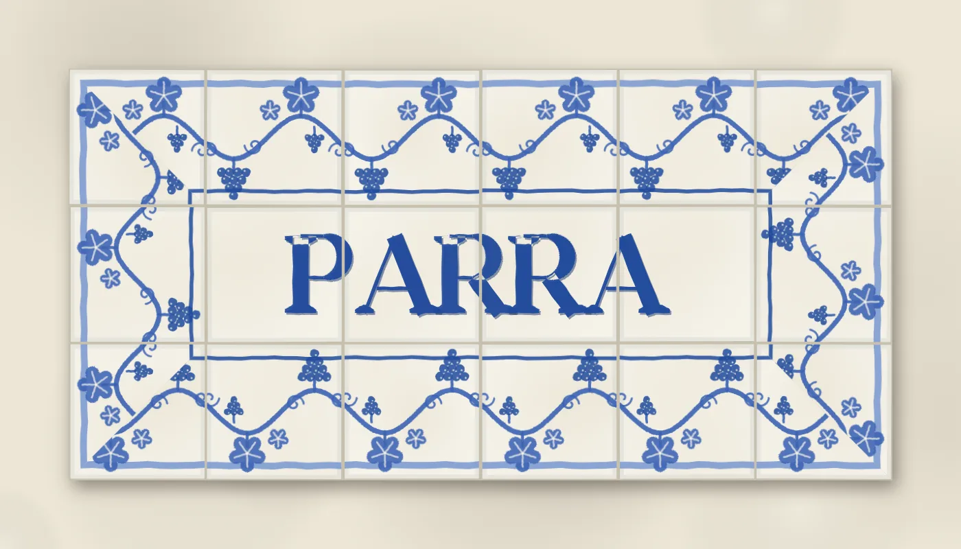
The vine, close. Leaves, bunches and tendrils in one blue, the veins and the lights left in the glaze.
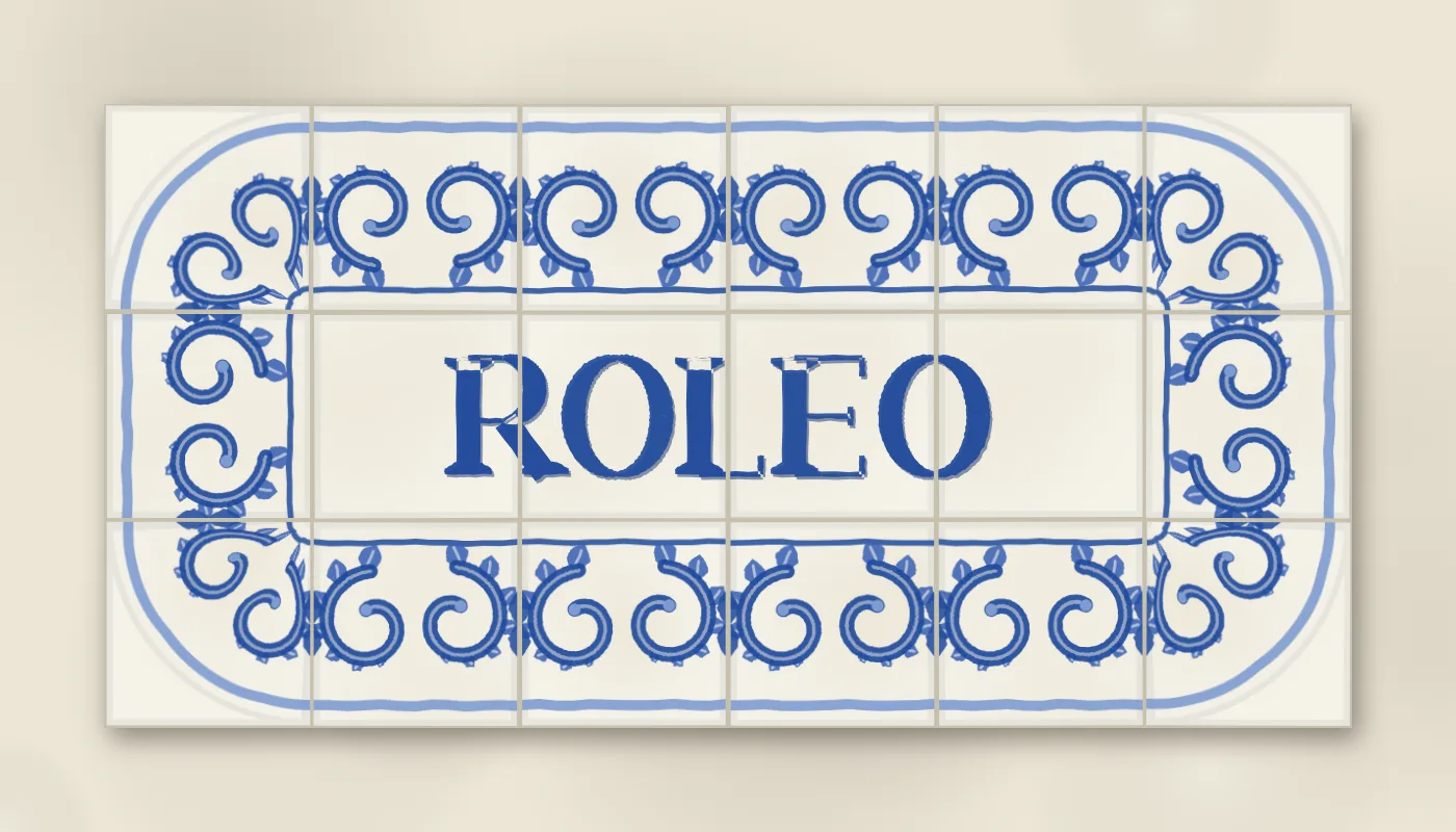
The acanthus, close. Two scrolls to a tile, fronds along the outside of each sweep, a bud at the joint.
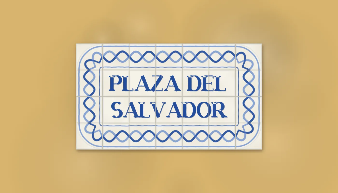
Plaza del Salvador on albero render, with the ribbon. Both ribbons meet their own ends at the joint, so the border is continuous round the plaque.
Five more. A flat yellow band with a sprig on every tile, a five-petal flower with a white heart, a leaf each side and dots round it, for the shop signs that put one letter to a tile inside a strip. Those signs use half-height border tiles, two to each letter tile, so the border has a size of its own, whole or half, and with the band on, every letter tile gets a small curl and dots in its corners so the letters and the band read as one set. A chain of rings, where the ring on the joint passes through the ring in the middle of each neighbour. A ribbon in two blues, which is two sine waves half a turn apart. And the rules alone.
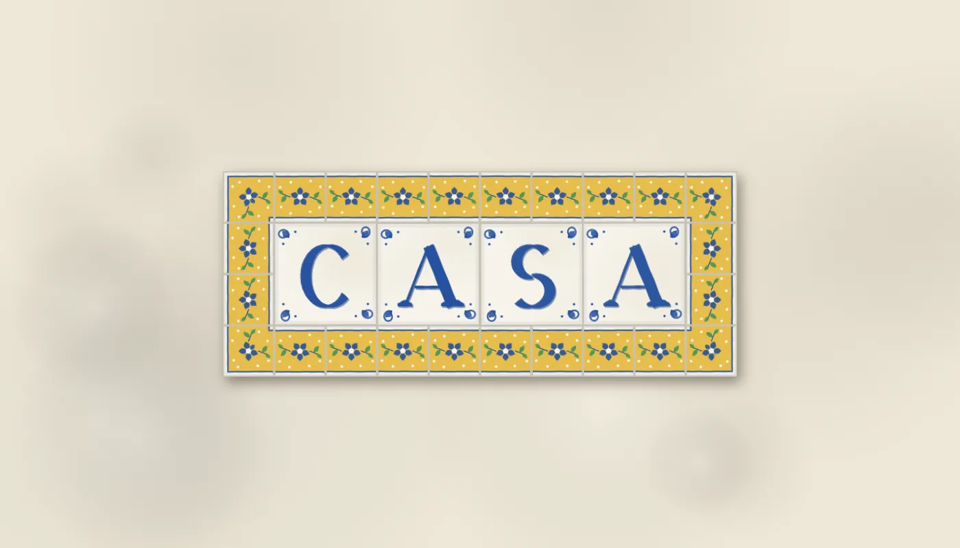
Casa. One letter to a tile with a curl in each corner, inside a band of half tiles with a sprig on each, in the santa ana colours, the corners mitred.
The one thing not drawn by rule
The Portuguese plaques go further than a border of tiles. The whole frame is one painting, a rococo cartouche of C-scrolls and shells that ignores the grid entirely and is cut into tiles afterwards. There is no repeat in it to write a rule for, so for that one border the page does what Fajalauza and Delft did for their birds and figures and uses a drawing: an image model was asked for a flat cobalt cartouche on white with an empty centre, and the page lays plain tiles, multiplies the painting over them so its white disappears into the glaze, draws the joints back through it and paints the word in the middle. Every other border on the page is drawn from a rule. This one is a picture, and it says so here.
The cartouche: a painted frame cut into tiles, the one border on the page that is a picture rather than a rule.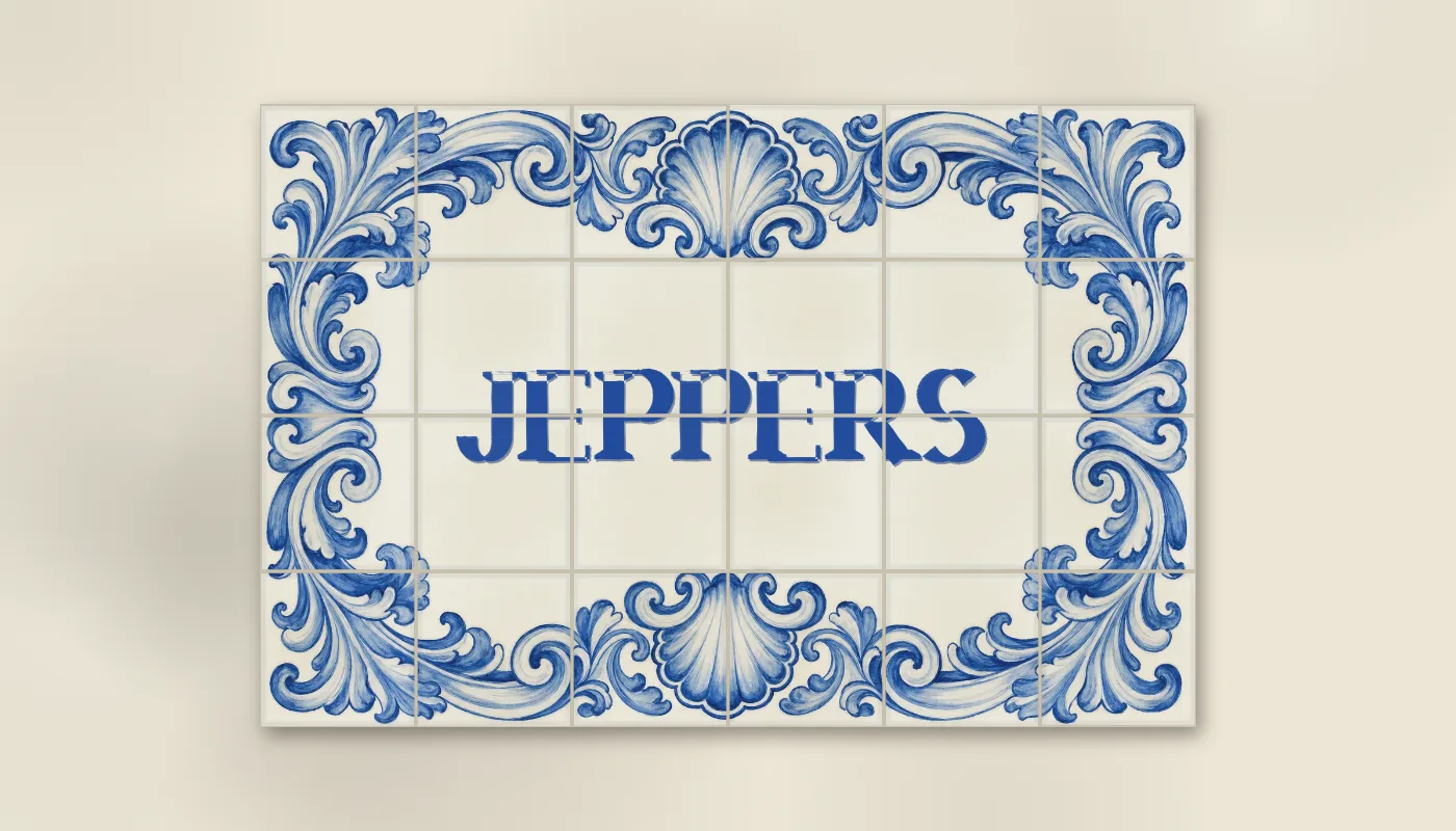
The wall behind it is whitewash, an ochre render, a blue wash or a field of plain glazed tiles, and the plaque stands proud of the render with a shadow. Age crazes a few tiles, warms some and chips a corner, and stains the lime.
A banner tool
I built this one partly because I wanted it. The text goes in the query string, so a link like letras.html?text=STEP%20INTO&border=roleo&field=anil is a banner, and the save button gives you the PNG.
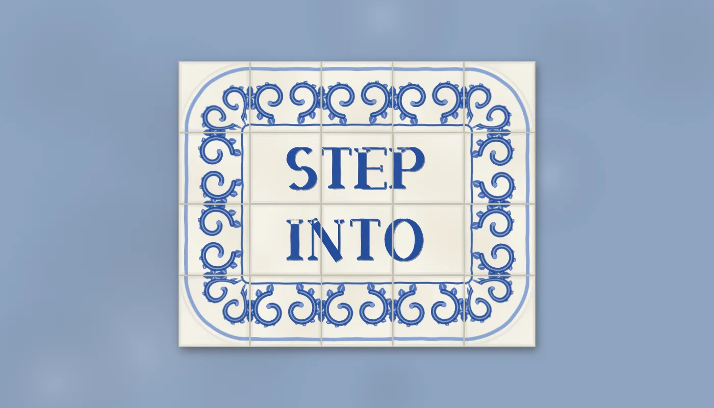
This site’s name, as a plaque on añil. The ?text= query string makes it.
The typeface stayed on the page. Nothing else has wanted letters painted by rule yet, and the pattern across this series has been that a thing moves into the engine the second time a page asks for it. Sutton Hoo is next, garnet cloisonné in gold cells, the cutter’s third customer.